VERIS WEBSITE
PROPERTIES
THE GOAL
Reorganize the page to prioritize the information prospective residents care about most, while adding value through curated neighborhood maps and FAQs.
THE SOLUTION
Using feedback from community managers and website analytics, we moved key elements (contact information, tour CTAs, and availability) to just under the fold. User feedback also indicated that apartment features should appear before amenities, followed by the full image carousel.
CREATIVE DIRECTOR
Katie Meier
COPY WRITER
Abbey Renaud

PROPERTY DIRECTORY
THE GOAL
Help prospective residents more easily browse and filter properties based on their needs, while highlighting portfolio-wide draws, such as the Veris Promise and sustainability initiatives.
THE SOLUTION
Default View: A text-based chart separated between state, city and community.
List View: A filter tool populates information cards based user-indicated preferences.
Map View: An interactive map that displays nearby properties within the portfolio.
CREATIVE DIRECTOR
Katie Meier

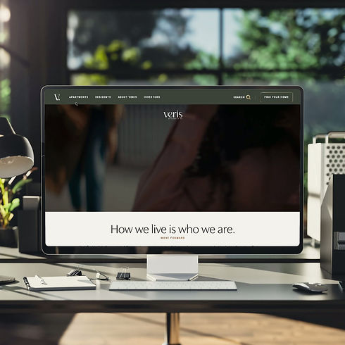
NAVIGATION
THE GOAL
The existing website relied on a hamburger nav that no longer reflected the company’s evolving brand. The website’s hamburger navigation became increasingly difficult to navigate as new pages were added.
THE SOLUTION
After researching navigation patterns across real estate and retail websites, I moved forward with a three-tier navigation that better organized content and guided users based on their needs.
1st Tier: Organized the experience around the four primary audiences: Prospects, Residents, Job Seekers, and Investors.
2nd & 3rd Tier: Simplified deeper site content into intuitive navigation pathways that improved discoverability and helped users quickly access relevant information.